
Product Design
Increasing Predictability and Reliability in Public Transport in the Federal District
Company
SEMOB-DF
Role
Product Designer
Duration
1 Month
Year
2026
Context
DF no Ponto is a transport app created by the Government of the Federal District to help residents plan and track their journeys. Although it offers real-time information and service alerts, users report low confidence in timetable accuracy, inconsistent navigation and limited accessibility.
In a region where many people depend on multiple buses daily, unreliable information increases stress, delays and uncertainty. Over time, users rely more on personal experience than on the app, which weakens trust and reduces continued usage.
Solution
I redesigned the core flows to improve predictability, reduce cognitive effort and rebuild user trust. Based on research, interviews, heuristic evaluation and usability testing, I prioritised high-impact issues and simplified search, route planning, line tracking and notifications.
The updated experience centralises key information, clarifies real-time status and introduces accessibility improvements, with the hypothesis that these changes would drive higher task completion, stronger trust in route data and increased retention.
Expected Results
Initial Analysis
A useful app was going unused. The reasons behind that were not visible from the outside. Looking into real usage patterns, reviews and direct conversations revealed that four problems kept surfacing across every source:
Pain Points
Accessibility
The interface isn't clear, increasing decision-making insecurity.
Reliability
The timetables are imprecise, affecting users predictability.
Navigation
The app flow is inconsistent, creating friction during actions.
Usability
The app demands significant cognitive effort during usage.
Learning with users
Four people who rely on public transport daily were invited to talk about their routines. The goal was not to ask about the app directly, but to understand their behaviors.
The conversations showed that users preferred to build their own strategies: leaving their homes earlier, memorising schedules and relying on personal experience.




With those behaviors in mind, four participants were observed using the app to complete real tasks: finding a line, planning a route, saving it, and tracking a daily trip.
The frictions didn't take long to appear. Navigation broke expected flows, route suggestions ignored basic safety logic and performance issues interrupted tasks at critical moments.
Turning insights into strategy
The research pointed to consistent patterns. With a clearer picture of what was breaking down, the problems were reframed as questions: how might the experience become more predictable? How might users feel more confident navigating the app?
Each question opened space for possible solutions. Dozens of opportunities were mapped, connecting directly to the pain points identified earlier.

Focusing on bigger impact
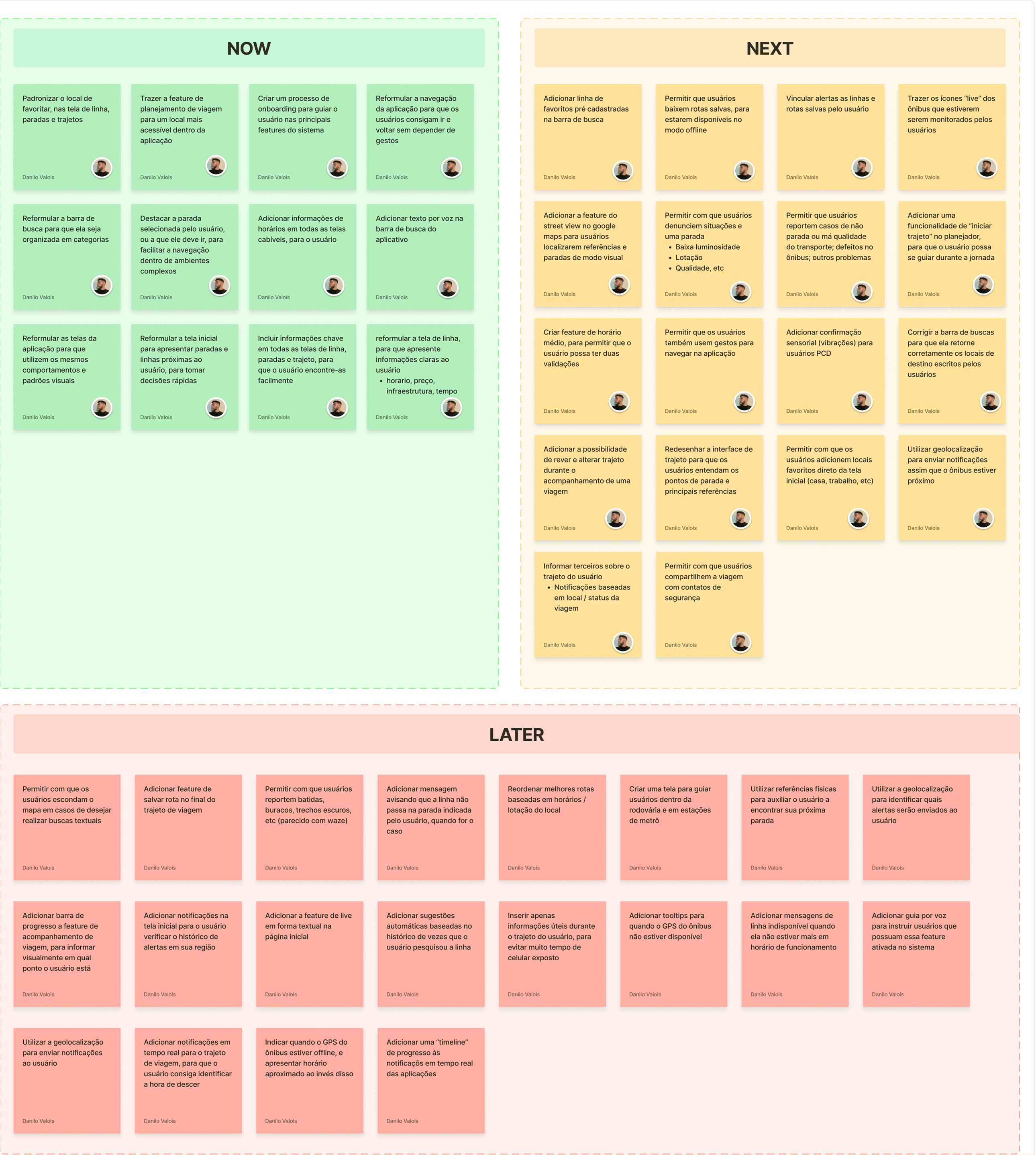
Not every opportunity could be addressed at once. A prioritisation matrix filtered what had real impact, and the selected initiatives were then organised into delivery cycles, defining a clear sequence for what would actually be built.

Redesigning the starting point
The home screen offered little context and no clear starting point. The new design brought the most important actions to the surface, making information faster to find and easier to act on.

Home screen -> Before

Home screen -> After
A new way to track lines
Key information tags were added to each line, along with real-time position tracking and a full itinerary view. The goal was to make line data easier to understand and help users make faster decisions.
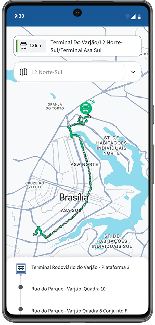
Line info screen -> Before

Line info screen -> After
Routes that fit the moment
The old version only showed the fastest route, ignoring what users actually needed at that moment. The new design offers route options based on different priorities: saving money, arriving faster, or avoiding crowded buses. Users choose what matters most for each trip.

Trip planner screen -> Before
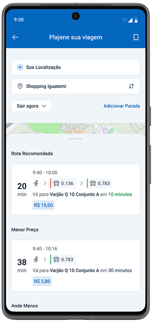
Trip planner screen -> After
Features built for the full journey
Three new features were designed to support users during and after each trip: live route tracking, trip ratings and problem reporting. Together, they improve the experience in real time and build a data foundation for future improvements.

Live Route View

Rating Trip Screens

Report Screen
Validating the new features
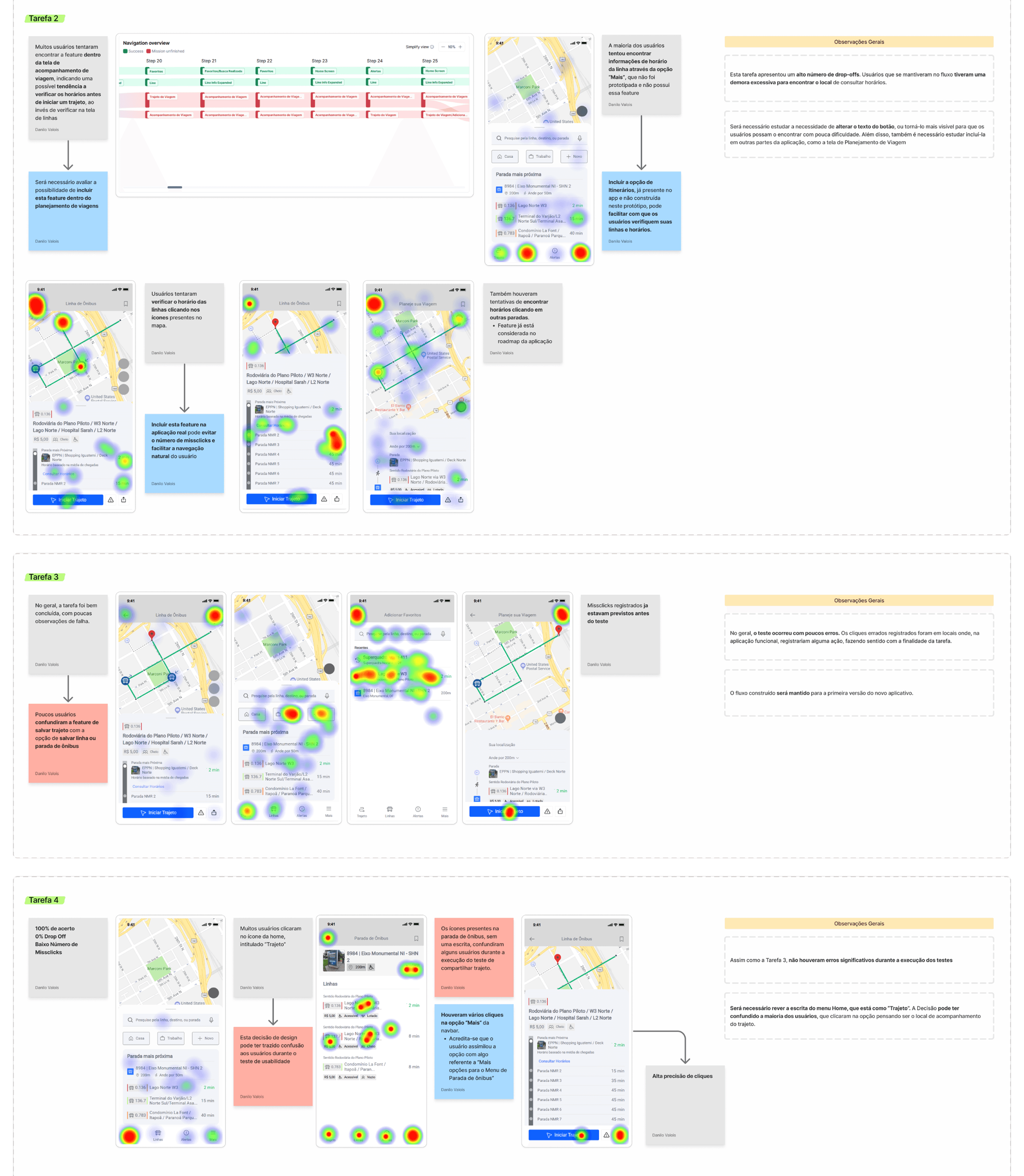
With the new interfaces defined, usability tests were conducted with 13 participants to validate if the solutions actually made sense in practice.
Testing early made it possible to identify friction points before moving to the final UI, adjusting what was not working in earlier stages.
Highlights
+80% Task Success Rate
Most participants completed the tasks without critical errors.
Average Time Under 60s
Tasks were completed within the expected time.
Low level of misclicks
Users completed their tasks without friction or confusing.
Improvements Identified
Screens that caused hesitation were identified and corrected.
Next Steps
Conduct More
Usability Tests
To validate the new and updated features.
Prioritise Remaining "Later" Activities
To evolve and enhance the developed system.
Validate Impact on Trust and Metrics
To measure all the changes that were realised.
Explore Community Data Integration
To increase predictability with real-time user information.
Lessons learned
Prioritisation
Keeping focus on what mattered most made it possible to deliver the project on time.
Pilot Testing
Running pilot tests before the real sessions reduced errors and improved the quality of the results.
Innovation is not always necessary
Following market patterns and focusing on usability corrections was enough to bring significant improvements.
Team and business constraints matter
Considering the team and company limitations was essential to deliver something realistic and viable.